About

Ahead of the Curve provides you with analysis and insight into today's global financial markets. The latest news and views from global stock, bond, commodity and FOREX markets are discussed. Rajveer Rawlin is a PhD and received his MBA in finance from the Cardiff Metropolitan University, Wales, UK. He is an avid market watcher having followed capital markets in the US and India since 1993. His research interests includes areas of Capital Markets, Banking, Investment Analysis and Portfolio Management and has over 20 years of experience in the above areas covering the US and Indian Markets. He has several publications in the above areas. The views expressed here are his own and should not be construed as advice to buy or sell securities.

Featured post

Time Series Analysis with GRETL

This video shows key time-series analyses techniques such as ARIMA, Granger Causality, Co-integration, and VECM performed via GRETL. Key dia...

Showing posts with label japan. Show all posts

Monday 4 April 2016

Chart of the Day - Global Central Bank Interest Rates

The chart of the day is courtesy of The Telegraph and discussed by Sol Palha on Safehaven, that shows several Global Central Banks have embraced very low interest rate or even Negative Interest Rate Policies (NIRP) to try and arrest deflation and fuel growth. The jury is out on whether this would work long term as such an experiment in Japan is ending in failure.
World Central Bank Interest Rates

Thursday 10 September 2015

Interesting Charts from the World of Economics and Financial Markets-2


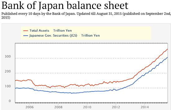
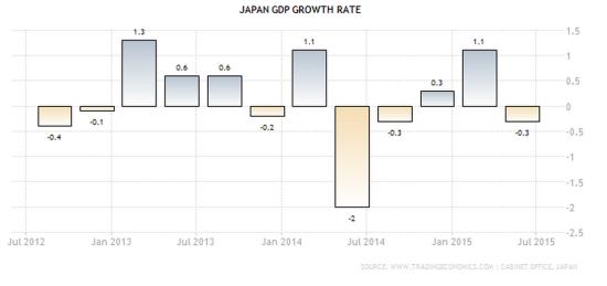
The first two charts are from John Rubino at dollarcollapse.com that shows that the Japanese economy hasn't recovered despite the record stimulus from the Bank of Japan:
BOJ balance sheet 2015
Japan GDP Sept 2015
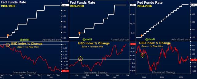
2) The next chart is from Ashraf  Laidi who compares the Dollar's performance during past Fed tightening cycles and suggests the #Dollar may have peaked already:
Fed Tightening Cycles & USD Performance - Fedfunds Usdx Sep 7 (Chart 1)

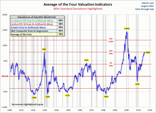
3) The last chart is from John Hampson at solarcycles.net that shows that the #SandP500 is in significantly over valued territory:
29augu11


You can see some more interesting charts here.

World Indices


Live World Indices are powered by Investing.com

Market Insight

My Favorite Books

  • The Intelligent Investor
  • Liars Poker
  • One up on Wall Street
  • Beating the Street
  • Remniscience of a stock operator

See Our Pins

Trading Ideas

Forex Insight

Economic Calendar

Economic Calendar >> Add to your site

India Market Insight

My Asset Allocation Strategy (Indian Market)

Cash - 40%
Bonds - 20%
Fixed deposit - 20%
Gold - 5%
Stocks - 10% ( Majority of this in dividend funds)
Other Asset Classes - 5%

My belief is that stocks are relatively overvalued compared to bonds and attractive buying opportunities can come along after 1-2 years. In a deflationary scenario no asset class does well other than U.S bonds, the U.S dollar and the Japanese yen, so better to be safe than sorry with high quality government bonds and fixed deposits. Cash is the king always. Of course this varies with the person's age.