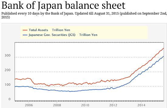
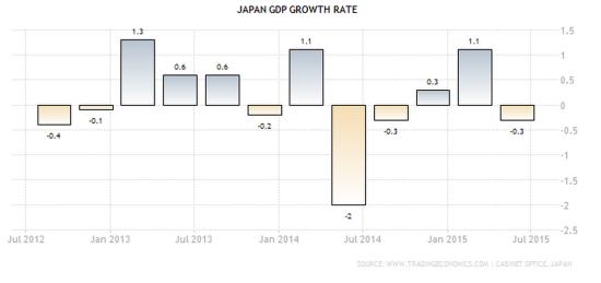
The first two charts are from John Rubino at dollarcollapse.com that shows that the Japanese economy hasn't recovered despite the record stimulus from the Bank of Japan:
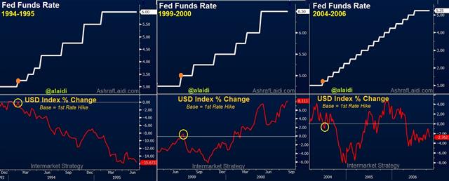
2) The next chart is from Ashraf Laidi who compares the Dollar's performance during past Fed tightening cycles and suggests the #Dollar may have peaked already:
3) The last chart is from John Hampson at solarcycles.net that shows that the #SandP500 is in significantly over valued territory:


2) The next chart is from Ashraf Laidi who compares the Dollar's performance during past Fed tightening cycles and suggests the #Dollar may have peaked already:

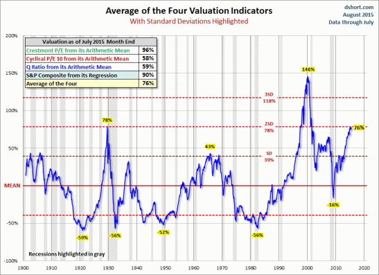
3) The last chart is from John Hampson at solarcycles.net that shows that the #SandP500 is in significantly over valued territory:

You can see some more interesting charts here.
Interesting Charts from the world of economics and financial markets
http://t.co/UjJMixfRRt pic.twitter.com/uf46iJ5wfy
— samuelR (@RajveerRawlin) September 10, 2015

No comments:
Post a Comment