
1) The first chart comes from Bloomberg which captures the entire set of events around China’s stock market crash:

2) The second chart is from Craig Hemke at goldseek.com highlighting a death candle on the long term S and P 500 chart that typically forms during major market tops as was the case in 2000 and 2008:

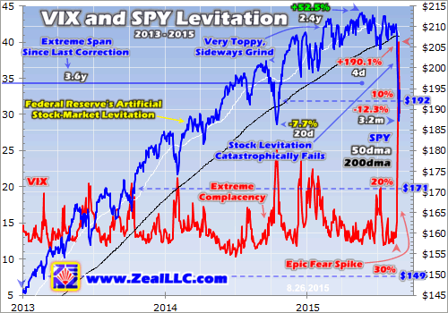
3) The third chart is from Adam Hamilton at Zealllc.com that suggests the recent spike up in the #Vix is a warning that the Fed’s grip on the markets may be reducing:
4) The last chart is from Clive Maund at clivemaund.com that shows the massive 7 year rising wedge in the S and P 500 breaking, suggesting further downside ahead:

Interesting Charts from the World of Financial Markets
http://t.co/EXI5sDDNlb pic.twitter.com/TA2IspAPrj
— samuelR (@RajveerRawlin) September 7, 2015
No comments:
Post a Comment